Overview
A strategic communications specialist with four decades of experience across community sectors, First Nations work, and environmental advocacy across regional Australia needed a brand identity that matched her positioning. The practice is built on precision, cultural fluency, and getting the story right for very specific audiences. The identity needed to work across every touchpoint, from social media to government reports, and signal dependability without corporate polish.
CLIENT
Ironbark Communications
SERVICES
Brand Identity, Web Design & Development
YEAR
2026
LOCATION
Australia

The Problem
The Founder had a clear vision for who they were and what they offered, but their existing branding didn't reflect it. The logo they had developed was a detailed tree illustration, rich in intention but fragile in practice. At small scale, it dissolved. On a business card, a social media profile, a favicon, the mark that was meant to signal strength and reliability actually undermined their credibility before the conversation even started. For someone whose entire offer rests on clarity and cultural fluency, having a brand mark that couldn't hold its own across applications was more than a cosmetic problem. It was a credibility gap.

The Strategy
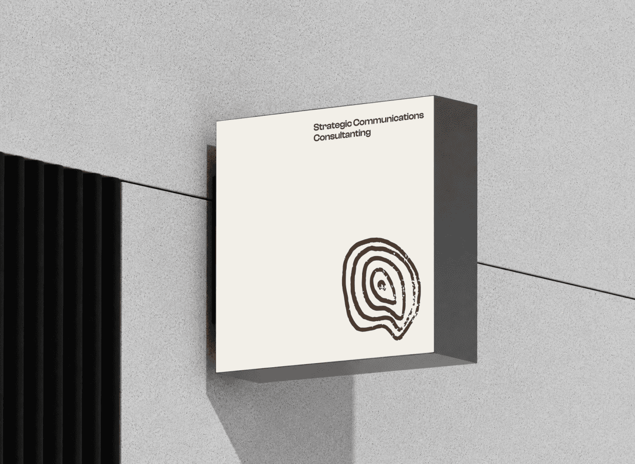
I simplified the ironbark symbol down to its most essential form, a tree cross-section. The rings became the visual language, moving from broad to focused as they move inward. Start with a communication challenge. Move inward. Get specific. Land on the answer. It's a closed loop - connection and communication as a system. The hand-drawn texture was deliberate. No perfectly smooth vectors, no corporate polish, just organic imperfection that signals human, considered, and real. There's a subtle geographic nod to Australia embedded in the mark itself, something that lives in the design thinking rather than on the surface, which felt right for someone whose specificity doesn't need announcing. I paired the mark with a clean, legible sans serif typeface that works across languages and reading backgrounds. The whole system feels dependable and quietly polished.


